Website Finalization and Project Presentation
Having completed my article, I started to think of how to display my writing. I also reconsidered the fonts used in my website and I decided change them from 'Futura' to 'Reklame script' and 'Palatino Linotype' because I want to distinguish the 'About me' title from the rest of the writing. Palatino Linotype is slightly sharper and I think it looks more like a newspaper/media typography .
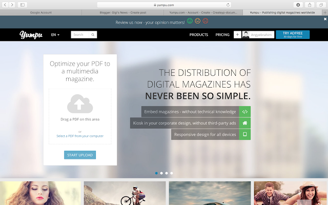
The initial idea was to use flip book to display my article. After Nixon told me he would use a flip book for his article about football I pictured it and I thought it was suitable because many news about football are or were presented in newspapers and magazines. However I have never seen a feature article in a newspaper, so I didn't think that recreating a newspaper using a flip book would be a good idea after all. When I did my research on The Guardian I looked on how the features were presented to have a better perspective. I eventually chose to create a subpage to my portfolio page and this page will display the article itself. I added buttons that link the subpage which I named 'Feature article' to the portfolio page. The buttons shows 'view more' in the portfolio page and 'back to articles' in the subpage.
I decided to use a table or grid from 'add' which I could customize to show the title and introduction to the article. I added a picture of a plane crash found on Unsplash because I did not want to repeat the pictures I shot since they will be on the subpage. As I mentioned before, the 'view more' will transfer to the article itself. Then, another button 'back to articles' will return to the portfolio page.
I have deleted the Feedback page, and now the website is ready for the article.


Comments
Post a Comment