Website Editing
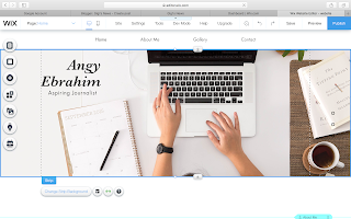
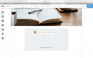
In the past few days I have been editing my website trying to find most suitable choice of images that can reflect my progression route and that can fit well with the type of layout chosen. I have found some difficulties because most of the images appeared cropped when uploaded as the "strip background". Despite this, I have found a picture that does not appear cropped, and uploaded this photograph as the strip background.
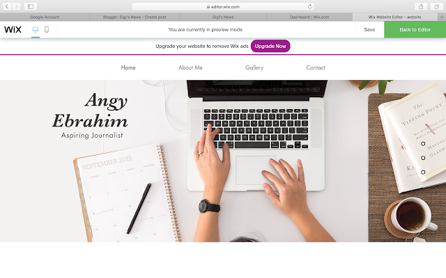
I have decided to change the photograph because I believe that this image reflects my progression route better than the previous image (can be found in my last blog post). This photograph shows the tools that can be used by a journalist so it gives an insight to the audience while the picture before just showed a bridge. The background of the bridge might appeal more since its more colorful, but it it does not show the purpose of the website.
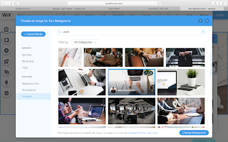
The process of changing background was very simple.
The same process was used to upload this second image, however I found this image when I searched "Magazines and Journalism". I positioned this photograph in the home page, within the gallery section as shown by the "Anchor Menu" on the right side.
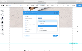
The button beneath the picture was part of the template, and I linked it to gallery page using these steps:
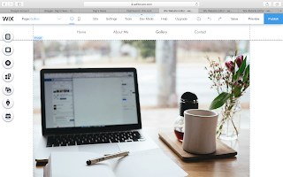
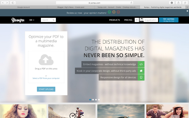
A third image was uploaded, followed by a flip book creator. The flipbook creator will be used to display my work. An introduction will be added to this page in the following days, it will explain what my major project will be about and perhaps why I chose it.
I have decided to change the photograph because I believe that this image reflects my progression route better than the previous image (can be found in my last blog post). This photograph shows the tools that can be used by a journalist so it gives an insight to the audience while the picture before just showed a bridge. The background of the bridge might appeal more since its more colorful, but it it does not show the purpose of the website.
The process of changing background was very simple.
- First thing to do is to click on the image until you see "change strip background"

2. Press "image" and then press "Unsplash"
3. Search for the type of image you want to upload, in this case I typed "work" on to the search bar
4. After finding the image, I pressed on "Change background"

The same process was used to upload this second image, however I found this image when I searched "Magazines and Journalism". I positioned this photograph in the home page, within the gallery section as shown by the "Anchor Menu" on the right side.
The button beneath the picture was part of the template, and I linked it to gallery page using these steps:
- Click on the button and press on "link"
- Choose which page to link it to, in this case Gallery
- Done

Moving on to the gallery page
A third image was uploaded, followed by a flip book creator. The flipbook creator will be used to display my work. An introduction will be added to this page in the following days, it will explain what my major project will be about and perhaps why I chose it.


The rest of the features in the website remained the same, such as the font, contact from and menu box and they are discussed in my previous blog post.



Good blog post with the technical process clearly explained. I do think your website has improved significantly with the new images as they reflect your progression route better. Well done.
ReplyDelete