Website- Changes applied for project presentation
Steps taken to modify website:
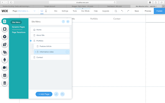
1. Added a new subpage to the 'Portfolio' page that will be used to display the project (named it informative video)
This is the raw image I shot for the preview of the project
I used the tools of Wix to modify the image: Cropped image, Increased brightness, decreased temperature, increased exposure, increased sharpness and used vignette
3. I used the Parallax effect on the home background strip by pressing 'Change Strip Background' → settings → parallax
9. Changed the previous image with button in the home page that linked to the 'Portfolio' page
Used a hover box
Add → box → hover box → change image in both regular and hover (image from unsplash) → linked to 'Portfolio' page → change color text from white to black
And finally, looking back at the home page I slightly made the menu bar larger
1. Added a new subpage to the 'Portfolio' page that will be used to display the project (named it informative video)
2. Portfolio page→Add button → Lists & Grids
- I selected the same grid template as the previous project customized it by writing my own title and introduction
-I double clicked on the text to choose the highlight effect colour
-I changed the image with an image shot by me ↓ (see process down)
-I used the font Palatino Linotype
This is the raw image I shot for the preview of the project
I used the tools of Wix to modify the image: Cropped image, Increased brightness, decreased temperature, increased exposure, increased sharpness and used vignette
Final image uploaded:
3. I used the Parallax effect on the home background strip by pressing 'Change Strip Background' → settings → parallax
The previous website design only had the 'About me' information with no image.
4. I added a strip with 2 columns placing the information on the right and the image on the left
5. Changed font to Linotype Didot site 66
6. Uploaded project and added button and line
Add→ button
Add → shape → lines
7. Linked the button to the 'Portfolio' page
8. Add → text→ Understanding our Dreams and Unconsciousness (Playfair Display bold size 55)
9. Changed the previous image with button in the home page that linked to the 'Portfolio' page
Used a hover box
Add → box → hover box → change image in both regular and hover (image from unsplash) → linked to 'Portfolio' page → change color text from white to black
And finally, looking back at the home page I slightly made the menu bar larger


Comments
Post a Comment