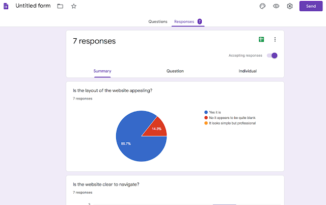
Based on the UX Feedback, the majority of my classmates think that the layout of my website is appealing and clear to navigate. I'm glad because I think that these are the most important functions. Some said that the introduction paragraph to the major project should have more information but the article itself holds a lot of information, so I think the introduction should just give the main idea. Perhaps, I will explain why I chose this topic on a final reflection blog post. All of my peers think that the font, images and contact form are appropriate. 28% say that my home page does not reflect my progression route but 71% say it does. I think there are many elements suggesting a website belonging to a journalist. For example, the words 'Aspiring Journalist', the choice of images showing magazines, documents and a computer and also the button 'view my articles'. Most of my peers believe that I should add more image...



Comments
Post a Comment