Website Creation
The creation of my website was made during class with the website "Wix.com"
- First thing was to choose a template. The template should reflect my progression route, in this case I chose the journalist template.
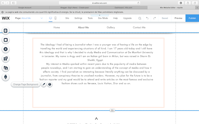
- Afterwards, I started writing my "About Me" page in class and finished it in my self study time. In the "About Me" page I introduced myself and explained what am I doing at the moment and what are my plans for the future. I also wrote the reason for which I am interested in journalism. I have chosen to surround the text with a pink box that I might change later on when I start thinking more about the layout of the web. The font used is called "Futura" I will keep this font as I think it displays the words very clearly and it does not appear to strong but it has more of soft mark.
- I added a contact format with multiple boxes to fill in the First name, Last name, email, phone and message. The boxes are a grayish color that resembles the color same as the color used to write the information about me. The submit button also matches the color of the box shown above. I think that both pages are too blank so I will probably have to add a background or something that grabs more attention.
- The Last thing I covered was home page, I have chosen a background from the images available on the background section. On the top you can see the menu of the pages in the website. Since the background is very colorful I decided to keep the menu simple and neutral with no bright colors. The answers to who I am and what I am doing are shown with my name and the words "Aspiring Journalist". This was part of the template so I decided to keep it.


Comments
Post a Comment