Initial Ideas for advertisement
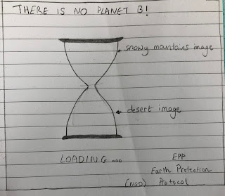
For our new assignment, Rea and I are supposed to design an advertisement. We thought about creating an advertisement about global warming that will look like this:

As illustrated, the focus of the advertisement is an hour glass that will show a beautiful snowy image on the top half while the bottom half will show a very hot and dry desert. The slogan will be "There is no plant b" and we will create an NGO called "Earth Protection Protocol"
I will discuss the font selection and layout, along with the process of creation in my next post.
Research:

This picture was made by Sabir Nazar:; Nazar is a Pakistani painter and and editorial cartoonist that has worked for many NGO's such as HRCP Pakistan, Action Aid, OXFAM and UNICEF. His cartoons are regularly published Express Tribune, which is affiliated to the International New York Times.
This photograph was used by an author and international expert on climate change, called Arek Sinanian, on a report by the World Climate Order Committee regarding global warming. Sinanian explains the planet's recent achievements.
I have researched other global warming advertisements and I believe these two pictures might help me develop our own. In the first image created by Sabir Nazar, where the ice is melting you can get a clear idea of the effects on global warming and how fast it is occurring. This is the kind of idea we want to express in our advert, using different images of course. The second image is a good example of a double perspective. This is what we are planning to do however the images will have to blend in one another and we will use narrow passage to create a blending so that the two images can merge accurately. The second image also helps us by showing the difference of colors used in the two perspectives. Instead of bright green colors we will use dark blue colors (like the first image) on the top half of the hourglass, and on the bottom half we will use orange and red colors.
I have noticed that many global warming awareness advertisements, such as the WWF use little words and focus on the main image in the advert. The cause can be explained in a matter of how to reach the audience. A sad image will appeal more to the audience that some writing. Visual codes are very important in advertisements because the main image, depending on the colour or the photographs used, will be the first thing that the audience will see. Therefore, many global warming advertisements focus on the image rather than the writing.
Sources:
- https://www.cartooningforpeace.org/en/dessinateurs/sabir-nazar/
- https://www.cagle.com/sabir-nazar/2019/09/global-warming
- https://www.fairobserver.com/more/environment/climate-change-environmental-news-global-warming-latest-world-news-47902/
- https://www.adsoftheworld.com/media/print/wwf_fish_0
- https://www.adforum.com/creative-work/ad/player/49872/ice-cream/wwf


Good that you have added your initial idea with a sketch. However, there is a lack of research. Please make sure you look at other advertisements and add this research to your blog with critical commentary and evaluation.
ReplyDelete