Advertisement on Global Warming
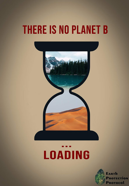
Global warming is a big issue nowadays the is affecting the whole world.
Australia is suffering from extremely hot and dry weather that has resulted in devastating bushfires. These bushfires have already scorched millions of acres and slaughtered an estimated half a billion animals in the country (Law, 2020).
This example was provided to emphasize on the importance of climate change and the terrible effects it is causing to our planet.
Process of creating the advert:
- New document -width (8.267) -height (11.962)
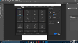
- change background color
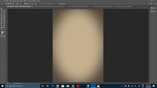
- add vignette - use the elliptical marquee tool, create a selection, feather the selection ( select > modify > feather), feather 250 px, invert selection (select > inverse)
- Add a curves adjustment layer (layer > new adjustment layers > curves)
- Adjust the curves to control the vignette effect
- Download an hour glass from Vecteezy
- Extract the file and open it on adobe illustrator
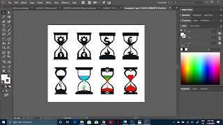
- Ungroup the vector (select > object > ungroup)
- Transfer vector in a fresh window on photoshop by dragging
- After dragging, open the images.
- Paste them on window with the hourglass and send them back by dragging the hourglass layer to the top
- Create a gradient in between the images to show cohesion (tap on image > add layer mask > select gradient tool > drag ) do this to both images
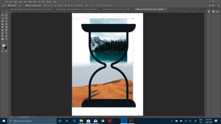
- Using the text tool add the slogan
- Draw a leaf shape using the shape tool and fill black
- To add the image, place the image over the leaf.
- Create a clipping mask over the photo (layer > create clipping mask)
- Merge the layers and paste them on the advertisement
The layout chosen in the advertisement is the Big-Picture Layout. This specific layout was chosen because the hour glass, which is the main image inside the advert, is the focus of the poster and it is what needs to be transmitted to the audience to make them realize that the Earth is heating up more every day.
The slogan helps to communicate to the audience that the Earth is our only chance and we have no other option, and that we have to act fast.
The font used is called Bebas Neue and it is a strong and bold font, the most suitable to express an urgent matter such as global warming.
Different types of fonts are shown below to further explain the choice of using Bebas Neue font
- The first type of font is called Embassy BT. This font is too elegant and formal. It might be used to advertise an event.
- The second font is called Shermlock . This font, on the other hand, is not enough serious. For example, the "A" looks distorted in a funny way. It can be used for advertisements with comedy or animation.
Sources:
- Vecteezy (2020) Hourglass concepts design [Online image] Available from: https://www.vecteezy.com/vector-art/662122-hourglass-concepts-design [Accessed 18/01/20]
- Berners Lee, M (2019) There Is No Planet B. Cambridge, England : Cambridge University Press.
- Unsplash (2019) [Online Image] Available from: https://unsplash.com/photos/30LwccUkjDs
- Unsplash (2019) [Online Image] Available from: https:// unsplash.com/ photos/CF42GAker4



This is a good blog post discussing your technical process and the choices you have made for the fonts and layout. You have used copyright-free images and vectors and have referenced everything on your blog. Well done.
ReplyDeletePlease make sure you add a blog post with the final outcome and reflection. Discuss what you learned from the project, what you could improve, and what went well.